|
|

| [back to "Optimizing server performance: Handling the Curves like a Pro"]
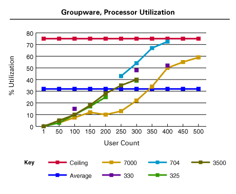
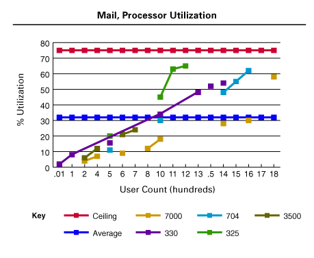
Amount of CPU used -- test results (sidebar)
The information in the charts below represents a subset of the entire information we collected. In this article, for each test we tried to present both ends of the spectrum, with the Mail workload as the light end and the Groupware workload as the heavier end.
Notice that the X-axis in each chart shows a different number of users that fit within the recommended guidelines.
|
 | |
|