 |
by
David
DeJean


Level: Intermediate
Works with: Designer 5.0
Updated: 03/03/2000

Inside this article:
Paste vs. import
GIF vs. JPEG
Lotus palette vs. Web palette
Dithered vs. "Web safe"
Screen vs. printer
The need for speed

Related links:
References and resources
R5 template graphics: The High Resolution Revolution

Get the PDF:
 (422 KB) (422 KB)


|  |
Graphics are more important than ever in Notes applications, mostly because of the Web. The World Wide Web has raised the bar for graphics. Notes applications which once could look like database reports now must look like Web sites, with colorful images and design elements.
But graphics seem to be a problem for Notes developers, judging from the discussion forums. The messages usually begin, "I pasted a picture into Notes, but something went wrong..."
Making choices that minimize surprises
Whatever the graphics problem, usually it began with a choice -- a choice of file format to use, a choice of how to get the graphic into the Notes document, a choice of methods for optimizing the image.
Here's a list of the choices this article will cover:
- Paste vs. import
- GIF vs. JPEG
- Lotus palette vs. Web palette
- Dithered vs. "Web safe"
- Screen vs. printer
Some of these choices are just matters of personal preference, like "paper or plastic?" or "do you want fries with that?" You do what works best for you -- what fits your graphics software and working habits.
Other choices, though, have right and wrong answers. You can do it either way, but one way is much better than the other because it yields more predictable results. The goal is "no surprises." Some choices work reliably. Other choices can give you surprises.
The result is that application designers have a whole new skill-set to master. Fortunately, while the Web has helped create the problem, it has also helped provide solutions: standardization on a few file formats, codified knowledge of color palettes, and improved graphics-handling tools.
1. Paste vs. import
The easiest choice to make is how to get graphics into your Notes form or document. What could be easier: you just copy a graphic onto the clipboard in your graphics editing program, then switch into Notes and paste it, right?
Wrong.
The problem is the clipboard. It doesn't preserve the original file format of the graphic. Instead, it converts the graphic to a proprietary Windows format that doesn't work cross-platform. So Notes does the only thing it can do: When you paste a graphic from the clipboard, Notes saves the graphic in a format it understands: the Notes graphic format.
 | Color palette -- The colors included in a graphic. The number of colors is a function of the "bit depth" of the graphic's format. The GIF format, for example, uses an eight-bit code to describe each pixel in the image, and renders a palette of 256 colors. The JPEG format uses a bit depth of 24, so it can render 16.7 million colors. |
The Notes graphic format has a limited palette of 256 colors. Even if there are more colors in the graphic, its color depth is reduced to 256.
But it can be fooled, and the results can be awful, as this example shows. The original, on the left, is a small section of a scanned image saved as a JPEG file containing 141,672 colors. Pasted into a Notes document, it was automatically converted. The result, on the right contained 256 colors, but -- surprise! -- the palette didn't include enough reds to render the artwork acceptably.
(Notice, too, what happened in the background areas. The reduction in the number of colors changed smooth transitions from yellow to green to gray into abrupt splotches of the single color on the palette closest to the original tones.)
Solution: import files by name
The influence of the Web has greatly simplified the options for graphics file formats. The first graphical Web browsers supported two file types: GIF and JPEG. As a result, they have become universal standards. Notes 5.0 adopted the standards, which will let you import GIF and JPEG files into your document or application and avoid many of those "something went wrong" problems.
Imported GIF and JPEG images are stored "inline," which means they are included in the application file, not stored separately or treated as attachments. The are stored in their native file formats and downloaded with full fidelity from the Domino server to either Notes 5.X clients or Web browsers, and rendered in Notes just as they are rendered in a Web browser.
So if you're working with GIFs and JPEGs, the best choice for getting them into Notes is to import them. You can use either the Create dialog (click on Create - Picture) or File - Import. In either case select the file format of the image you want to bring in and enter or browse for the filename.
If you are working with graphics in other formats, things are slightly more complicated. Notes knows about the graphics file formats shown below, but it doesn't treat them all equally. A BMP file, for example, can contain 16.7 million colors, but because it won't work across platforms, Notes converts and stores it as a Notes-format file of 256 colors.
There are hundreds of graphics file formats, while the list of formats Notes will import is short. It can seem even shorter because it works only with particular versions of some formats -- TIFF 5.0, for instance, but not TIFF 4.2.
The solution is use a graphics editor to convert the image into a format that can be imported into Notes -- to save it in a different file format and a different bit depth, if necessary. (For the names of some useful tools, see the References and Resources section at the end of this article.)
An exception to the rule
Importing GIFs and JPEGs has one drawback. Notes clients before 5.0 understand only one inline graphics file format -- the Notes format. When older versions of the Notes client encounter an inline GIF or JPEG image they ignore it, so it doesn't display.
This shouldn't be a problem for a well-planned application. (It's most likely to be a complaint of users who include images in mail messages that don't show up at the other end.)
 | Here's a tip: The key is knowing which client will be used to view the application. You're designing in Notes 5.0. Here are your options:
- If the application will be used by Notes 5.0 clients, it's a no-brainer -- use GIF and JPEG images wherever possible, and import them for best results.
- If your audience will be Web browsers, import GIFs and JPEGs. Use a graphics editor to reduce other image formats to 256 colors and save them as GIFs before you import them into your application.
- Only if your audience is older Notes clients, do not import GIFs and JPEGs. You can copy them to the clipboard and paste them into your application. But the "oops" factor will be high -- they'll be converted to Notes format. To minimize surprises like color shifts and unpleasant dithering, use a graphics editor to reduce their color depth to 256, save them as GIFs and import them.
Here's where the real value of Release 5.0's inline support for GIFs and JPEGs becomes apparent. You can serve the same application to both browsers and Notes 5.X clients. No more do you have to design one set of forms for Notes users and another for Web users. And you can deliver JPEG files to Web browsers without the awkwardness of having to include them as attachments in your application. |
2. GIF vs. JPEG
Whether to use GIF files or JPEGs is one of those "paper or plastic" decisions: it depends on what you're going to put into it. Some types of images do better as GIF files, some as JPEGs.
Rule of thumb: If the image is a photograph, make it a JPEG. If it's anything else, make it a GIF.
 | JPEG -- A standard image compression algorithm optimized for compressing photographic images. "JPEG" stands for the Joint Photographic Experts Group, the committee that developed the standard. A JPEG file contains 24 bits of color information per pixel, so it will render 16.7 million colors, but it is a "lossy" format, meaning that some of the file data may be lost in the compression process, resulting in reduced image definition. |
 | GIF -- Stands for "Graphics Interchange Format." The GIF format is a standard for image files defined in 1987 by CompuServe. GIF files are limited to 256 colors, but it is a "lossless" format: while the data is compressed the rendering of the image is not altered. The current version of the GIF specification (GIF89a) also supports animation and interlaced rendering of the file. |
The primary considerations in making a choice between GIF and JPEG are file size and color fidelity. For photographs, JPEG is the best in both departments: JPEG compression produces files are smaller, and they render more colors.
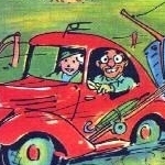
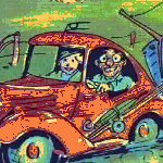
But JPEG compression doesn't work well for images that contain large areas of flat color, such as presentation graphics from programs like Lotus Freelance or Microsoft Powerpoint. The process of compressing an image for storage and then decompressing it for display adds artifacts that make flat areas of color look dirty or ghosted. Compare the enlarged section of a GIF file on the left with the JPEG version on the right.
For all types of files other than photographs, the GIF format produces the smallest files. Smaller files mean quicker downloads -- very important for both Notes client and Web browser users. And even in cases where GIF and JPEG versions of a graphic are roughly the same file size, a GIF may display faster because it doesn't have to be decompressed for display.
 | Another tip: Always save graphics used as design elements (logos, rules, dingbats) and text saved as graphics (words of text in fancy typefaces, for example) as GIF files. A GIF file can have a transparent background, which allows graphic elements to blend with the background of the page. More importantly, GIF files won't surprise you as often. Once you set the palette for a graphic and save it as a GIF, it won't change. The colors won't shift, and the image won't ghost. |
3. Lotus palette vs. Web palette
The Notes graphic format is a modified GIF file (it doesn't have the standard file header). Like a GIF file, a Notes file includes a defined palette of 256 colors. But where a GIF file can contain any 256 colors, a Notes graphic file contains a particular set of colors, chosen because it produced the most consistent results across all Notes platforms.
When the World Wide Web caught up to Notes, it, too, acquired a palette of colors carefully selected to display well across many platforms.
Neither this palette, called the "Web-safe" palette, nor the Lotus palette actually consists of 256 colors. There are 226 colors in the Lotus palette and 216 in the Web-safe palette.
 | CLUTs -- The Lotus and Web-safe palettes are technically not "palettes" but color look-up tables (CLUTs) that map the logical color numbers stored for each pixel of the image to the actual colors, represented as RGB triplets, that are displayed on a computer monitor. RGB values express the red, green, and blue components of a color as numbers from 0 to 255, which allows for 16,777,216 colors.
RGB triplets are slightly different from the more familiar hexadecimal triplets used in HTML code. HTML color values for elements such as page background and links are expressed as triplets of hexadecimal (base 16) numbers from 0 to FF -- or 256 values. Black is 0,0,0 in RGB and 00,00,00 in hex code. White is 255,255,255 RGB and FF,FF,FF hex. Red is 255,0,0 or FF,00,00, and so on. |
Why are there only 216 Web-safe colors and 226 Lotus cross-platform colors, rather than 256? Because in each case the developers of the palette decided to exclude some colors that weren't judged to display well on all the target platforms. (For more on Web-safe colors, see the reference to Lynda.com at the end of this article.)
How different are the two palettes? Not very. Here are representations of both palettes. The Lotus palette on the left has 10 more color values assigned, and includes more shades of gray than the Web-safe palette on the right. (These are only approximations of the actual colors: If you're sharp-eyed, you'll notice that the Lotus palette displays some of the ghosting characteristic of a JPEG file -- the best way to represent its colors. The Web-safe palette is a GIF.)
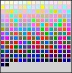 |  | 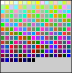 |
| Lotus palette |  | Web-safe palette |
Here's another way of looking at palette differences:
Each column above shows a reduced image of the custom color-picker from the Notes client and a section of a photograph. The color picker box makes a convenient device for displaying a full spectrum of colors and grays. The sections of the photograph show what happens to a full-color image when the number of colors it contains is reduced to the color values of the Lotus and Web-safe palettes.
- JPEG files -- The color picker box displays a full spectrum of colors and grays. The picture of the castle contains 50,200 colors.
- Lotus palette -- When the Lotus palette is applied to the color picker box, the number of colors in the image drops to 72. The mapping of the palette colors against the spectrum is interesting. It provides more variations for the bright, pure colors than the muted tones toward the bottom. The photograph shows the effects of this reduction in the sky, the palace roof, and the tiles in the foreground, where single colors have been substituted for a range of graduated shades, resulting in splotches of flat color.
- Web-safe palette -- When the Web-safe palette is applied to the color picker box, the number of colors in the image is reduced to 92 -- more muted tones than the Lotus palette, but fewer grays. The effect on the photograph is only slightly different from the Lotus palette, however: The Web-safe palette included more matches for the red in the palace roof and tiles, but fewer blues to provide variation in the sky.
Color palettes are applied to images in graphics editing programs. There are two versions of the Lotus color palette available -- one for Adobe Photoshop, and one for Jasc Software's Paint Shop Pro. (A link is included at the end of this article.) When the palette is applied, the color value of each pixel in the image is changed to the closest match in the palette.
 | The bottom line: Don't worry about palettes. They were important when VGA was young and the Windows default was 16 colors, but that was a long time ago. If most of your users are looking at your applications through Web browsers, or use Notes on workstations set to display 16-bit color ("high" color) or 24-bit color ("true color") palettes don't matter much.
The support in Notes 5.0 for native storage of GIFs and JPEGs makes the Lotus palette pretty much obsolete -- as long as you remember to import your images and not paste them.
The Notes client also includes a preference setting that makes Notes and browsers more color-compatible -- select File - Preferences - User preferences and check "Use Web palette." |
4. Dithered vs. "Web safe"
The Web-safe palette is called "Web safe" because its colors display in Web browsers across the greatest range of platforms as pure colors without dithering. Dithering, like color reductions, is one of those common problems that surprise the unwary designer.
Dithering -- the introduction of a visible texture of light and dark pixels into what had been a smooth tone -- is the result of specifying a color that isn't in the current CLUT. In a graphic in happens as a result of color reduction: A good graphics editing program will include tools for controlling the dither. On the Web, dithering can also happen as a result of specifying a color in HTML code that can't be displayed by the current color settings of the user's monitor.
Dithering mixes pixels of two different colors to approximate a third color. Here is a GIF file that displays four color samples, identified by their hexadecimal values. The top two colors are Web-safe, the bottom two are dithered. The pink square at the lower left, for example, says "ff8899," but it is actually composed of pixels of two non-dithering colors -- a slightly darker shade, ff6699, and a slightly lighter one, ff9999.
 | Color space -- Hexadecimal arithmetic neatly supports an orderly reduction of the color space from 16.7 million to 256 by using six values for each of the three additive colors -- 00, 33, 66, 99, CC and FF. A 256-color CLUT treats any combination of these values as a "pure" color (the "ffcc99" above, for example) and generates all other values by dithering. |
Your graphics editor software should give you some choices to control dithering. Dithering can be applied to an image in a regular pattern, as it is in the color sample above and the picture on the left below, or a random fashion, as in the picture on the right. Which style of dithering you choose depends on the image. The ordered dither probably works best for areas of flat color like the color sample, but random dithering might work best for photographs.
(Random dithering actually isn't random at all. It's the result of applying an "error diffusion" algorithm to the color conversion process. The dithering is done by calculating the "error" or difference between the actual color value of a pixel and the value of the nearest entry in the color palette, then adding this difference to the value of the next pixel. This weighting diffuses the effect of the color change through the image, yielding a more pleasing result.)
Dithering and file conversion
If you are trying to convert graphics from file formats that Notes doesn't support, you will probably want to get them into GIF format (remember the GIF vs. JPEG rule of thumb), which means you will inevitably have to deal with dithering. The key, once again, is making good choices among your options. Here are some examples prepared using the Paint Shop Pro graphics editing program:
JPEG file, 12.8K
Again, the standard of reference is a full-color JPEG file containing 7,137 color values. The inset shows an enlarged area to make changes more readily visible. | | |
GIF file, 4.4K
You can avoid dithering altogether by converting the image to a 256-color file using the Web-safe palette, but the results, like this example, are seldom pleasant.
 The file is much smaller, but the number of individual colors in the image is reduced to just 17 -- even though the palette for this image contains the standard 216 Web colors. The file is much smaller, but the number of individual colors in the image is reduced to just 17 -- even though the palette for this image contains the standard 216 Web colors. | | |
Dithered image, 9.8K
Applying an "error diffusion" dithering algorithm to the color reduction process makes the result much more acceptable. The down side is that the dithering imposes a clearly visible grainy texture on the image. | | |
Optimized palette, 12.6K
An optimized palette (also called an adaptive palette) is another alternative to dithering. In an optimized palette color groups are included based on the frequency of their occurrence in the image, which helps this image a great deal.
 Using all 256 color positions in the palette rather than just 17 preserves a wider range of the tones in the image and makes it much more acceptable, even though the background still shows some splotchiness. Using all 256 color positions in the palette rather than just 17 preserves a wider range of the tones in the image and makes it much more acceptable, even though the background still shows some splotchiness. | | |
Optimized and dithered, 15.2K
Combining an optimized palette with "error diffusion" dithering produces the best result of all. But actually it's the worst result -- the file size of 15.2K is larger than the original JPEG file of our example. But remember, 15.2K wouldn't be nearly so bad if we had started with the same image as a TIFF file (it would be 34.7K) or a Targa file (58.8K). | | |
 | Fight dither with arithmetic. Dithering can be an unpleasant surprise when it shows up in graphic Web page elements that are specified by color value -- background colors for pages, frames, and table cells are the most common offenders.
Usually it's a cross-platform issue -- you picked a color that looked perfect on your 16.7-million-color PC screen, then saw it on a Macintosh and it looked different.
It may also happen as the result of a color-depth mismatch -- you may design in 16.7 million colors for users who live in a 256-color world (although this probably doesn't happen as often as it used to).
In any case, the solution is simple: pick your colors from the Web-safe palette. And which ones are they? They have hexadecimal values that are all combinations of 00, 33, 66, 99, and FF, arranged in red-green-blue order. The higher numbers are brighter colors than the lower numbers. So FF0000 is bright red, and 660000 is a very dark red. 0000FF is bright blue and CCCCFF is a very light blue.
There's a three-dimensional logic to hexadecimal color arithmetic that is hard to express visually. Lynda Weinman's "color cube" comes closest -- if you want to get really deep into color read her book, "Coloring Web Graphics.2", published by New Riders Press. If you just want to see a chart of the colors so you can pick one you like, the most useful Web color chart is the RGB Hex Triplet Color Chart designed by Doug Jacobson. Some other charts are listed at the end of this article. |
5. Screen vs. printer
Printing a Notes document can be a surprise. Text and graphics can change position and size in unexpected ways. If you're developing an application that will be used for printing you must decide whether to design for the screen or the printer.
The most common problems are caused by the mismatch between screen resolution and printer resolution and how you've chosen to handle the scaling of your graphics.
You can resize graphics two ways. In a graphics editor, you can resample the image to new dimensions. Scaling a 350-by-225-pixel image down by 50%, for example, yields a file that's 175-by-113. The size of the file changes, as well -- reduced to half as wide and half as high, it contains only 25% of the pixels in the original.
You can also resize a graphic in Notes, by changing the scaling settings in the images' properties. Scaling a 350-by-225-pixel image down by 50% changes the displayed size of the image to 175-by-113. But it does not change the size of the file. The file still contains all the data of the 350-by-225 image. It is just being constrained to smaller dimensions for display.
| Here's an example -- a partial screen shot of a simple Notes form containing half a dozen data fields and two versions of that 350-by-225-pixel image. The top copy of the image has been resized in a graphics editor to 175-by-113 and imported into the form where it displays without scaling. The bottom copy has been imported at its original size and scaled in its properties box to 50%. The results are identical -- both copies display on the screen at the same size. | | |
 | | |
| But what happens when the document is printed out? The two images aren't the same size anymore. The answer is that the printer isn't working with the same relationships between numbers of pixels and physical dimensions that the monitor is. It is in effect dithering the pixel data to its own resolution of 360 dots per inch. Because the two files contain very different amounts if data the output is different -- even though the printer has done what it can to minimize the effect of that difference. | | |
 | | |
| Change the resolution of the print-out, and the image sizes change -- and change their relationship to each other -- as well. Here the printer resolution has been increased to 1440 DPI and the printer's interpolation algorithms, with bigger numbers to work with, have done a better job. The difference between the two images is less. But the printer, in optimizing its output quality, has changed other things as well, like the linespacing and even the typefont (note the lowercase "g" in "Large"). | | |
 | | |
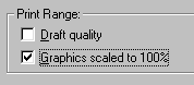
One other potential monkey wrench is the setting in the Notes print dialog to print all images at 100% regardless of their size onscreen, which produces this result.
 | | |
 | | |
All this gets even more complicated if your application will be used in both Notes clients and Web browsers. Browsers don't have the same resizing problems that Notes shows in these examples, but they introduce new variations of typefont and linespacing that vary not only from Notes but from browser to browser.
 | Obviously, the best way to avoid surprises with printed graphics is to maintain the relative relationship of the images. Either constrain them all by the same percentage, or resize them all outside of Notes and display them without constraining in the document.
Not constraining the images is probably the best course, because it has a couple of other advantages. Constrained graphics can undergo color shifts and contrast changes that may vary from platform to platform. And not constraining graphics means that the file sizes are no larger than they have to be, and download as quickly as they can. |
The need for speed
The graphics explosion has one obvious effect on Notes applications -- particularly when they're accessed over the Web: it slows them down. As a Notes designer you may not be too concerned about the delivery speed of your applications, but your users are. And devoting some thought and effort to keeping files small can have a real payoff in the users' experience.
Graphics contain far more data, and take much longer to download, than text files. The HTML file that includes all the text and formatting tags for this article, for example, is about 35K. The 40 or so graphics files total more than 500K. Graphics add a lot of data to move, particularly if your users are accessing your applications at dial-up speeds.
Here are some ideas for improving the users' experience of your applications by lessening the impact of graphics downloads. For more good ideas, check out the 5.0 Best Practices Guide on www.lotus.com.
 | Shrink files by reducing colors
Try reducing the color depth of images even below 256. Gray-scale images, for instance: This version of the Roman bust from the example above is a 16-color grayscale image with the complex shaded background replaced by flat colors. The result: It's 2.9K, rather than the original JPEG file's 12.8.
If you're really serious, invest in the right tools. Adobe Photoshop supports more bit-twiddling options than other graphics editors for color depth manipulations. And if you have many images software tools such as Debabelizer Pro or WebVise Totality can help automate the process of optimizing graphics, shrinking color depths and manipulating files. (See references at the end of the article). |
 | Make Web graphics seem to load faster
Waiting for graphics to display completely can have a psychological effect on the user. Both GIF and JPEG files can be set to display incrementally -- low-resolution at first, and sharper as the image data apparently "fills in." For GIFs this is called interlacing, and for JPEGs it's progressive rendering. They are set as options when you save the files in a graphics editor. The resulting files don't actually download any faster, but a partial display of a graphical navigator, for example, may give users all the information they need to take an action and move on before the page has finished building completely. |
 | Store graphics as image resources in your Notes applications
The Image Resource feature, new in Release 5.0, allows you to save an image once in an application, and then include it by reference multiple places in the application. This won't improve the download time of individual forms or documents, but it may significantly reduce the overall size of the application if instead of placing six copies of the same graphic in six forms you use six pointers to one copy of the graphic stored as an image resource. |
Conclusion
The improvements in the way Notes handles graphics in 5.0 have made it much easier to do high-quality work with images for Notes applications and the Web -- support for native GIF and JPEG files, the Image Resource feature, the "Use Web palette" option, are only the most obvious.
The first step in using these tools well is to understand the choices they make available, which ones lead to quality results and which ones lead to unpleasant surprises. If you understand the causes of ugly color shifts and grainy, dithered colors you're well on your way to correcting them.
The next steps are knowledge-based. Knowing how to use a graphics editor to control color depth and dither, and familiarity with the Web-safe color palette will go a long way to avoiding problems and improving the graphic quality of your applications.
References and resources
Graphics software and utilities
- Adobe Photoshop -- The most powerful graphics application on the planet, and plug-ins may make it the most powerful in the universe. But beware, learning curve ahead.
- Jasc Software's Paint Shop Pro -- It's not Photoshop, which can be a very good thing if you're not a digital Picasso and just want useful, flexible tools for image editing.
- LView Pro -- This "image processor" product is a Cheshire cat -- sometimes the visible interface is way minimal. It's not for image editing, but there are enough features here to do basic format conversions, color corrections, and lots of image maintenance chores.
- Debabelizer -- An automation environment for changing the formats, compression, palettes and much more on hundreds of files at a time -- a workhorse for big, graphically intense Web sites.
- Auto FX WebVise Totality -- An advanced graphics twiddler's toolkit: GIF and JPEG compression engines, a Photoshop animation module, digital watermarking, and a dithering engine for controlling the reproduction of non-Web-safe colors on the Web.
Web sites
|